
Every December, the Pantone Color of the Year is announced, the yearly rankings help set trends and inspire designs for fashion, marketing, and the creative arts for the year ahead. But how important is the Pantone Color of the Year, really? Is it all an industry gimmick or something designers and distributors actively utilize in their work for the coming year?
Fashion and the Color of the Year
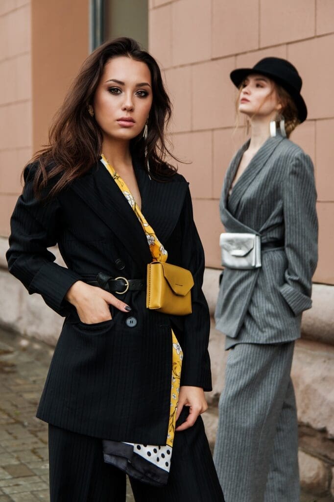
For 2021, the Pantone Color winners are Ultimate Gray and Illuminating, a vibrant golden yellow. These two tones have frequently been seen in mainstream fashion and interior design for some years, with the color scheme being favored by millennials, minimalists, and often those decorating homes and apartments for the first time. Utilizing both gray for a more casual look and the vibrancy of yellow, the colors will be seen more throughout fashion as designers rush to make sure their collections reflect this year’s choices.
The Illuminating yellow color has clearly helped inspire Balenciaga’s Demna Gvasalia, who has previously used the color to positive acclaim, including on the famous DHL logo-inspired yellow t-shirts and a yellow gilet. Balenciaga’s latest range includes a Balenciaga yellow logo top and matching hoody, combining the color with this season’s push for comfort.
Gray has been used in fashion across the board, too. Thom Browne has come into his element – he frequently uses color in his designs. Similarly, Max Mara has made his name by providing gray essentials for your wardrobe.
Branding and the Color of the Year
The Pantone Color of the Year can help designers understand what hues will be used across the industry, helping brand developers understand how the colors could be utilized within their branding. This could be in the year’s opening fashion campaign, marketing, social graphics, or even on a 2021 website refresh. The color combination could even inspire, on a smaller scale, office designs or complete home renovations.
Design and the Color of the Year
Many interior trends have previously incorporated the blend of a darker, industrial gray with a lighter yellow. So, it could be argued that Pantone took inspiration from this to determine the color match that would sweep across 2021. Certainly, the trend will be integrated more in design in the year ahead.
Designers will likely use the color scheme as inspiration for new pieces across interiors. For example, IKEA has a range of complementing yellow and gray pieces, including artwork, rugs, and room furniture. Yellow chairs are particularly popular against a backdrop of a gray rug and a complementing accent wall. Here, gray can be used as a fairly neutral color, while yellow can add a splash of personality and brighten up a room.
The Pantone Color of the Year is undoubtedly significant because it sets the baseline for fashion and branding development in the coming year. By choosing a set of universally decided colors, Pantone attempts to inspire cohesion across branding and design, as more people opt to utilize these colors in their collections. This will help people create a wardrobe consisting of a variety of brand names and pieces that reflect the style of 2021.
Featured Photo by Hannah Morgan on Unsplash


