It is hard to get a job. It is even harder to get a good one.
But you should focus on what you can control. That is why we have laid out the five most important resume design principles that if you follow will boost your chances of getting their interview call.
But why focus on design at all? After all, isn’t it all about your credentials?
In the words of Steve Jobs,
“Design is not how it looks, design is how it works”.
Without further ado, here is what you need to know about resume design:
1. Choose The Right Font
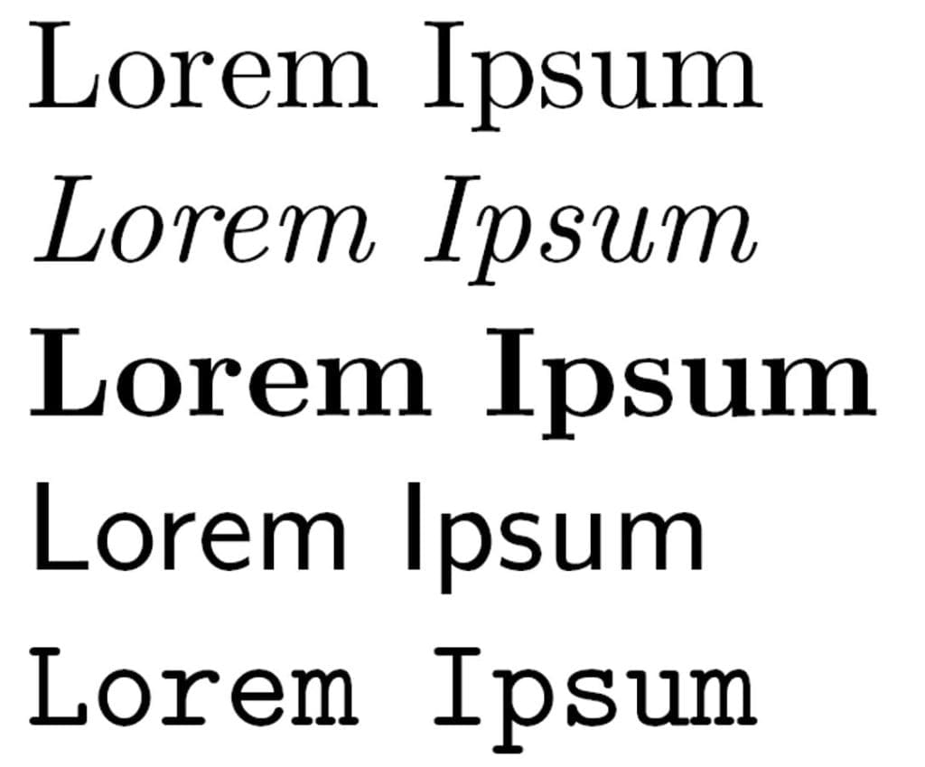
If you’re thinking how much of a difference fonts can make in the final hiring decision, realize that everything counts when you have no second chance. Fonts have a certain personality of themselves. Some fonts look clean and rigid, others look creative and artistic.
Most people use Arial or Times New Roman. This gives you the opportunity to stand out from the crowd by choosing a better font. But there are a few ground rules you should keep in mind before you select a font:
- Keep font size between 11 and 13 and make sure the font you choose is easily readable.
- Consistency is important. Choose the same font size for headings, the same size for subheadings and so on.
- Consider the personality traits you want to project through the fonts. Use this infographic to better understand which font corresponds to those traits.
For instance, Serif fonts are associated with being professional. The specific personality traits that Serif fonts project are being reliable, impressive, authoritative, and traditional. Sans serif fonts project you as being modern, clean, objective and stable. You should choose them if you are applying for a job in a creative field.
2. Make Your Contact Info Visually Appealing
Let us be clear. The only purpose of your resume is to get an interview call. And you don’t want to miss out on your dream job because of obscurity. In order to be chosen, you have to be seen first.
A retail merchandising study published by the University of Chicago Graduate School of Business inspected the sales impact of shelf placement of products. Although the kind of product being sold also determines sales figures, the products placed at eye-level display have higher sales than the bottom or top-shelf products.
This difference in vertical placement yielded 39% difference in sales. So what really matters when you’re trying to sell a product in a retail store or sell your resume?
Attention.
You have to get noticed. Only then the recruiter can consider you as the right candidate. So to get noticed, it is important that you make your contact info look prominent. Place your contact info at the top of the page. Make sure your contact details look clean and professional. Include your email address, contact number, name, and address. And if it suits your industry, include your social media handles.
Here are three ways you can make your contact info visually prominent:
- Use Icons: Icons are little symbols that are placed in the front of your contact info contents. So before your email address, there can be a ‘mail’ icon in the form of an envelope. Similarly, right next to your contact number, you can put a ‘phone’ icon.You can download these icons from the web. Although many services charge for such icons, there are other quality resources like icons8.com, where you can download icons for free.
- Use White Space: White space helps you break up different parts of your contact info including contact number, email address, home address and so on. It makes it look clean and organized. So use white space wisely.
- Use Color: You can use color for your contact info in multiple ways. Either you can choose a different color for the text in the contact info. Or you can choose a different background color for the entire contact info section. Ensure that the color choice is not too loud to distract the recruiter from reading your resume.
3. Make Your Resume Scannable
We live in a world where there is an excess of information. In such a chaotic world, every person has developed a coping mechanism – to skim and scan through complex information. Nobody reads emails or long news articles word by word. We all look for the key takeaways when consuming info and then we decide whether the entire content is worth our attention.
Therefore, it is important to make your resume scannable by using proper formatting in your resume. Here is what you can do to make your resume scannable:
a. Use Columns
Columns help you put a whole lot of information in your resume without making it look messy. This is important because it is absolutely necessary to keep your resume to a single page. Ideally, you should divide your resume into two columns of varying sizes. The small column could be used to highlight key achievements or skills. And the large column could be used to describe your experience, achievements, and education in detail.
b. Format Your Content
Use headings, subheadings, and bullet points. Ensure proper alignment of paragraphs. Edit out as many words as possible and delete sections if necessary. Don’t let your resume content exceed one page.
Brevity is crucial because recruiters typically spend just six seconds on your resume. Ensure that the content written doesn’t look cluttered.
4. Tailor Your Resume Design to Your Industry
If you are applying for a job in Data Analytics, consider an infographic resume that shows your competencies perhaps with bar graphs or Venn diagrams. The reason is that humans are visual creatures. Anything that carries visual data is going to make a better impact on your recruiter.
But it all depends on the industry you’re in. If you are applying for a job in administration, the overly graphic resume will probably not be acceptable. As it is with fonts, resume designs have their own personality. So know your industry, your audience, before you choose a resume design.
Not sure which resume design to choose? Here are some great resume templates to get you started with just a couple of clicks.
5. Packaging Matters
It is not just what is written in your resume, it is also how your resume reaches the recruiter. Don’t use Word or .doc format. Because when your resume is opened in Microsoft Word on a different computer, it can look dodgy and may not retain the original formatting.
So make sure you save the resume file in pdf format. A pdf works like a clean seal and preserves the formatting of your resume. You want to deliver your resume as is.
Next, the file name is equally important. You don’t want your resume to get lost in a pile of resumes just because you gave it a generic name. Include your first name, last name, and the word ‘resume’ in the file name.
Final Thoughts
Make no mistake about it. Your resume is a marketing document. It is meant to sell you as the better person for the job. So invest a good amount of time making it perfect. If you are short on time, you can always use paid services online to build an outstanding resume.
Only when the design is right, the recruiter will pay attention. And only then will your credentials come to the fore.
After all, you have got only six seconds of fame. So make it count!
Image credits; Image credits; Image credits


